THE Story
We consider ourselves incredibly fortunate to have had the opportunity to work on the evolution of Yoshinoya's visual identity, an iconic Japanese restaurant with multiple locations in Southern California. While Yoshinoya's logo was already established, our mission was to develop a fresh color palette and a dynamic communication style that would reflect the brand's essence in a modern and authentic way.
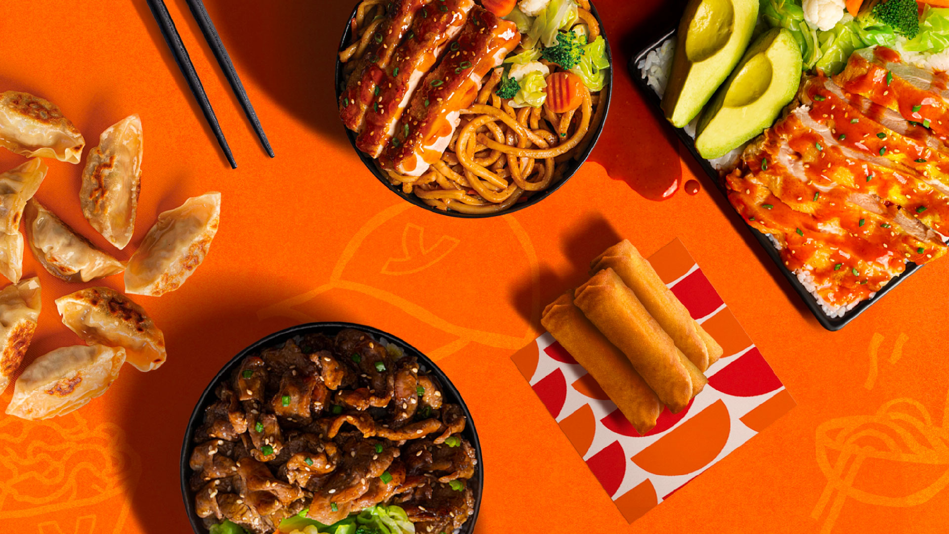
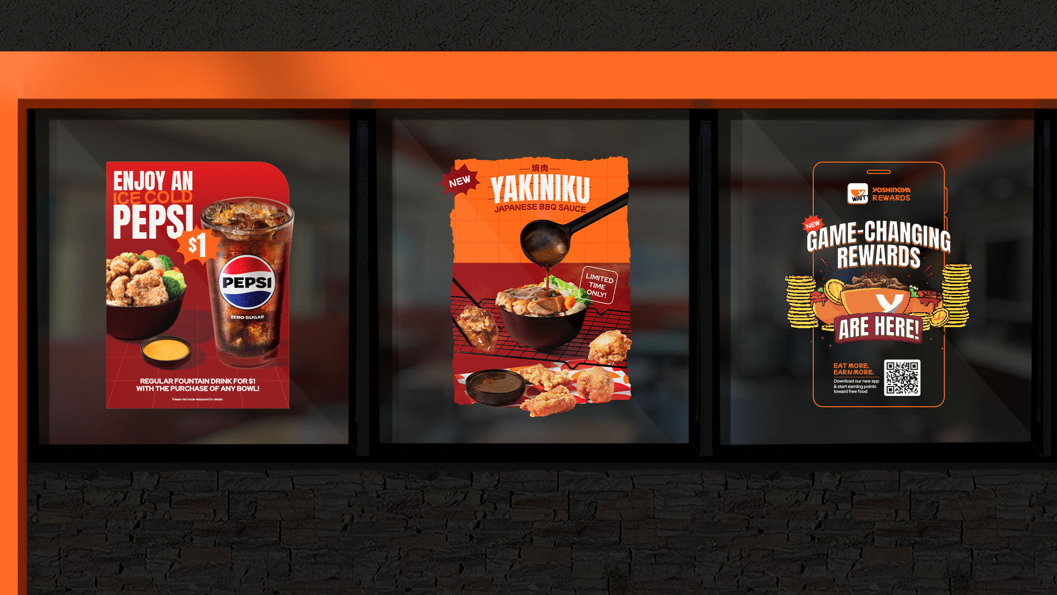
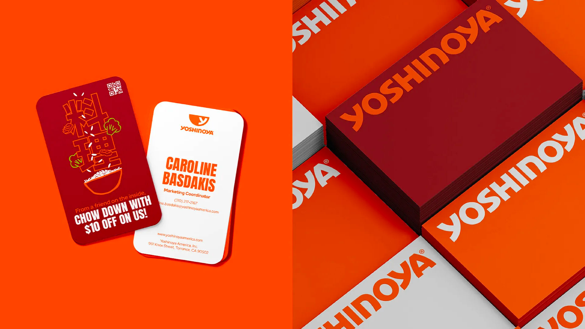
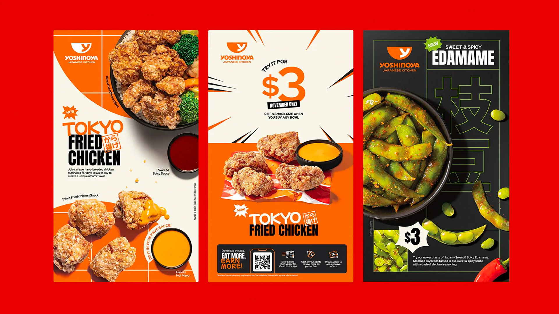
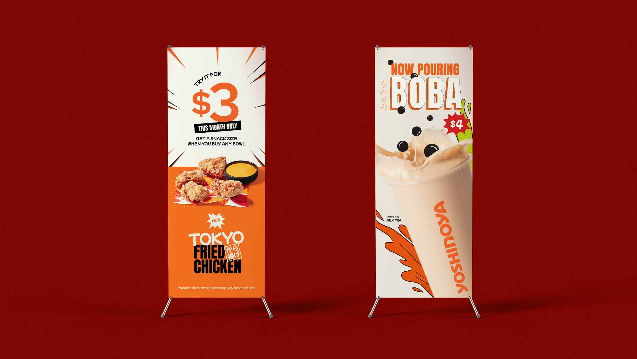
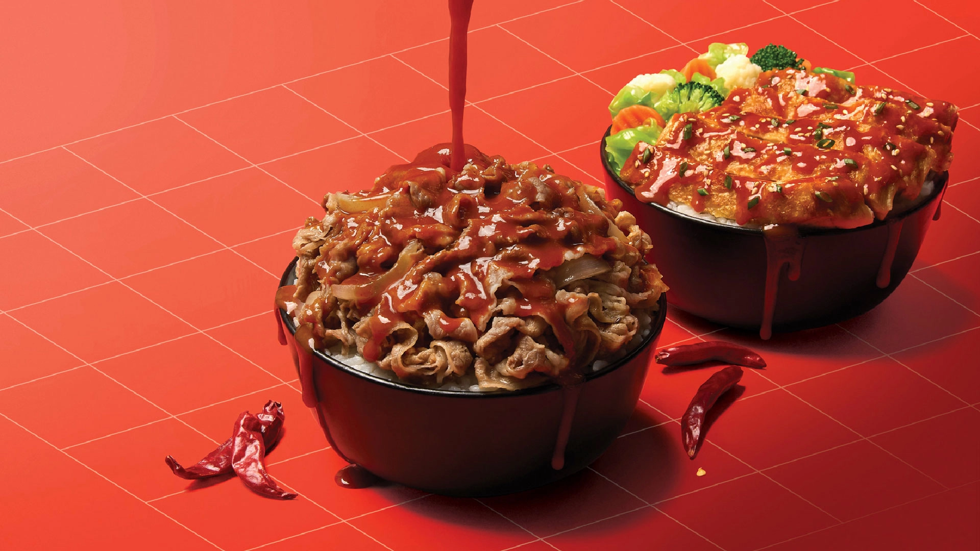
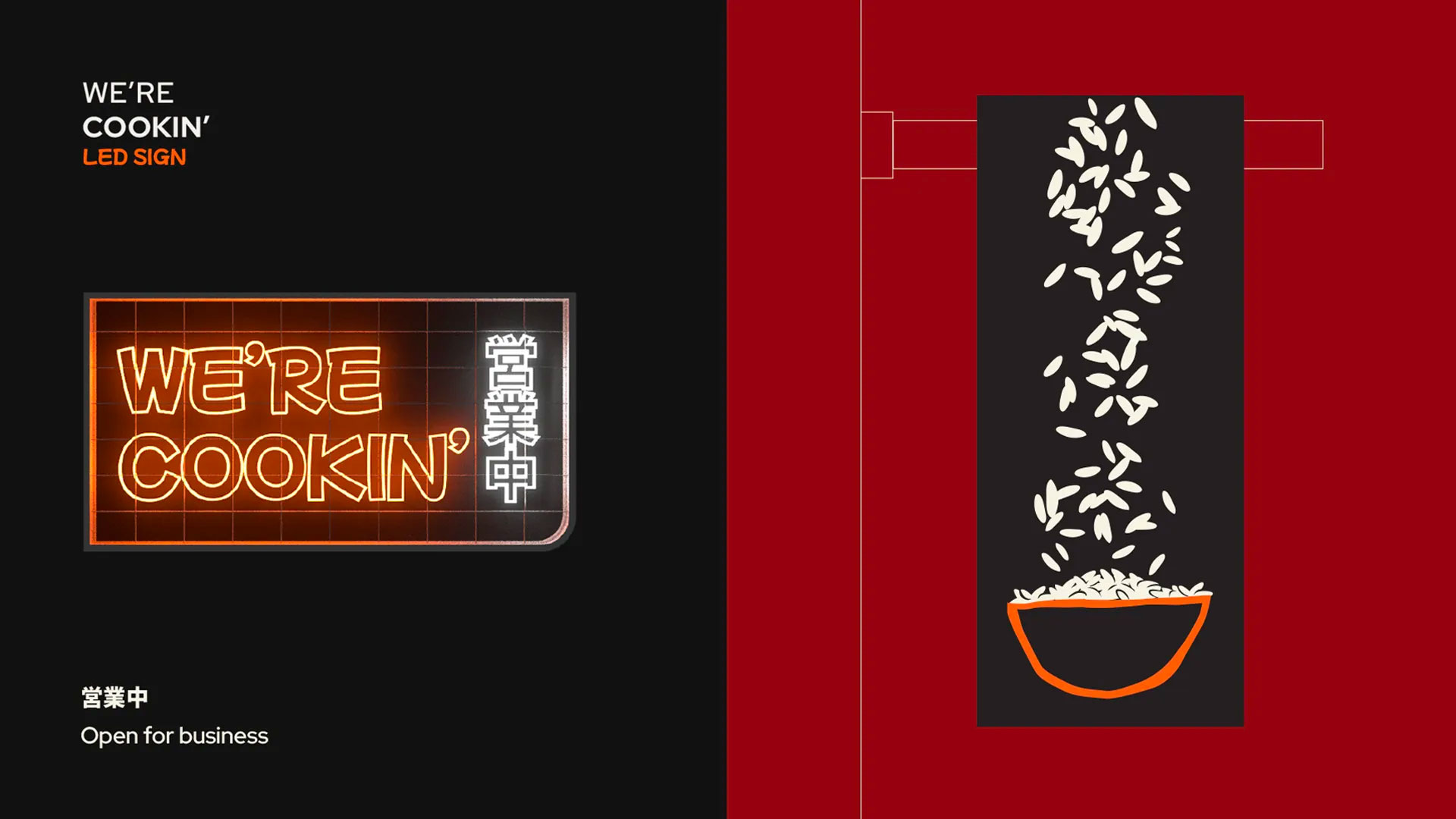
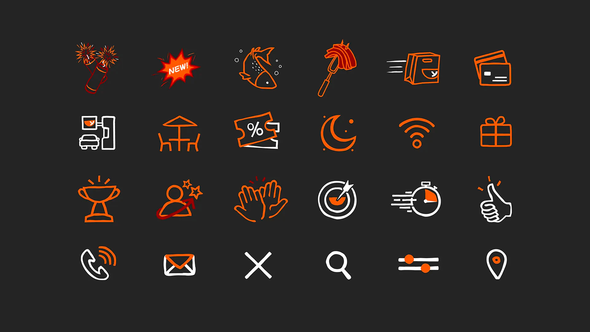
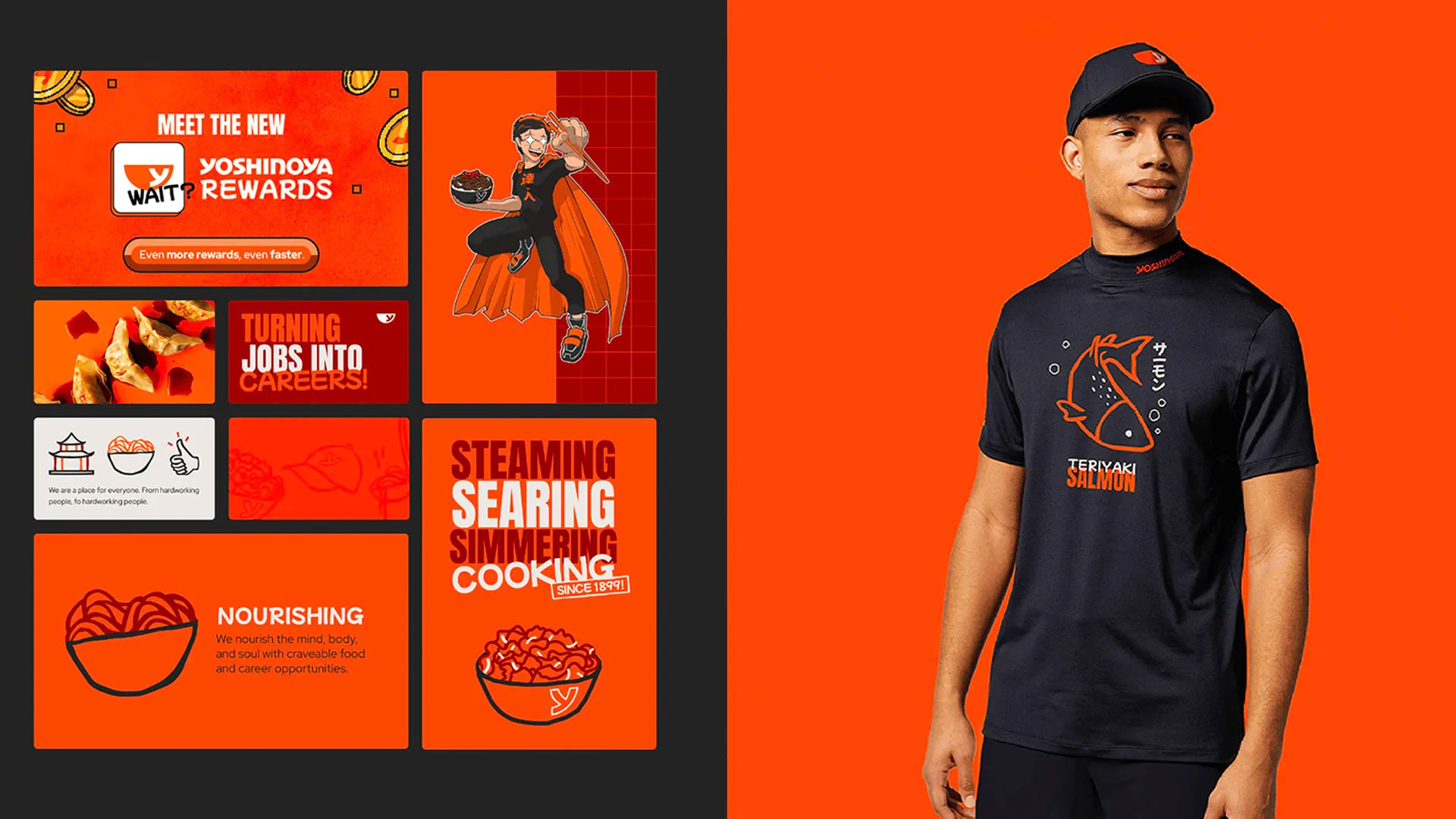
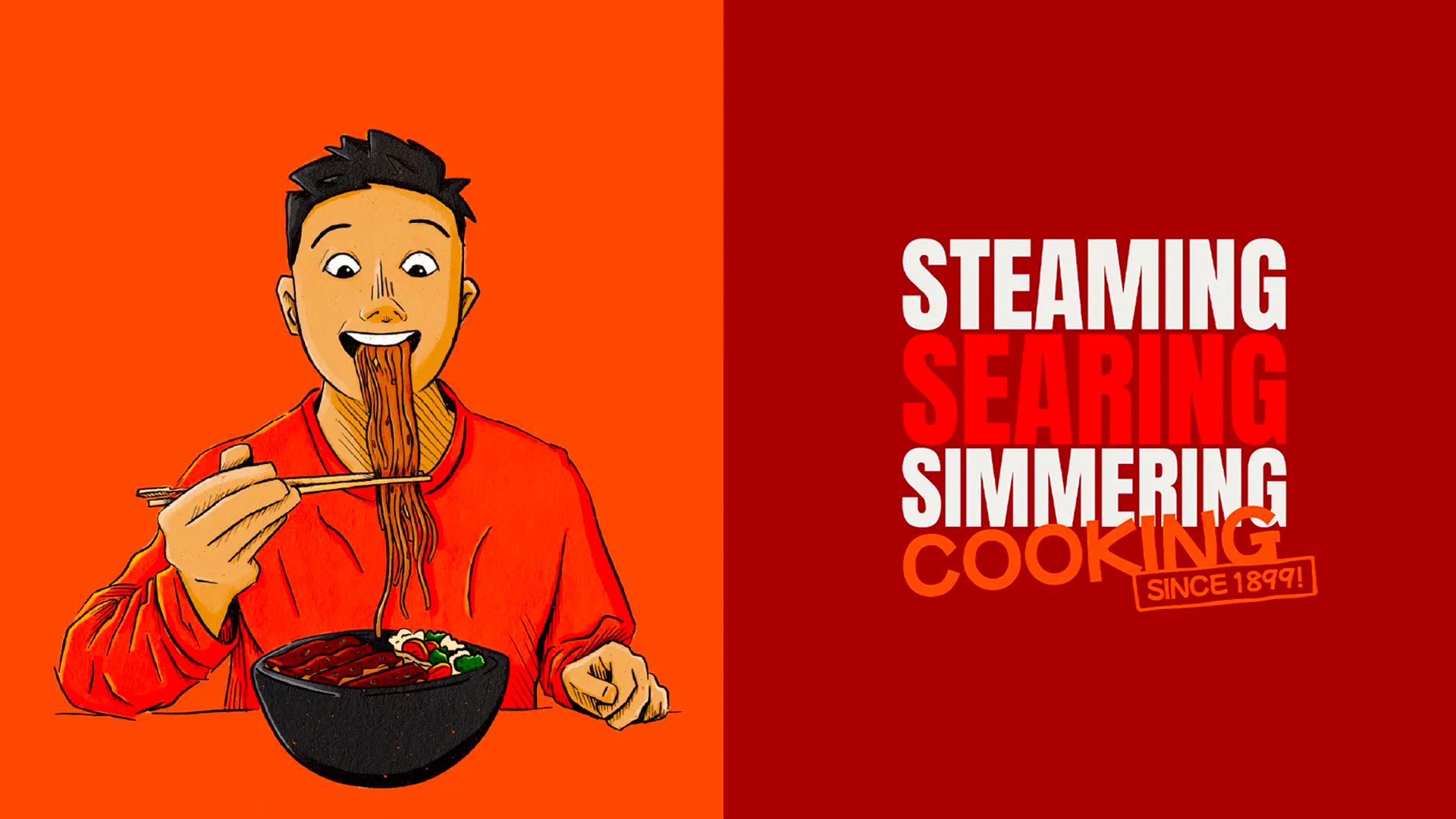
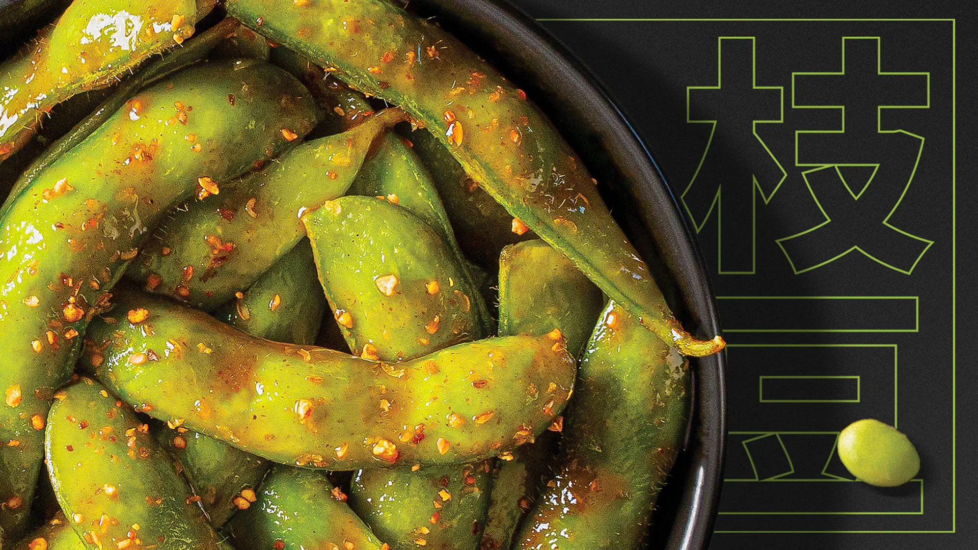
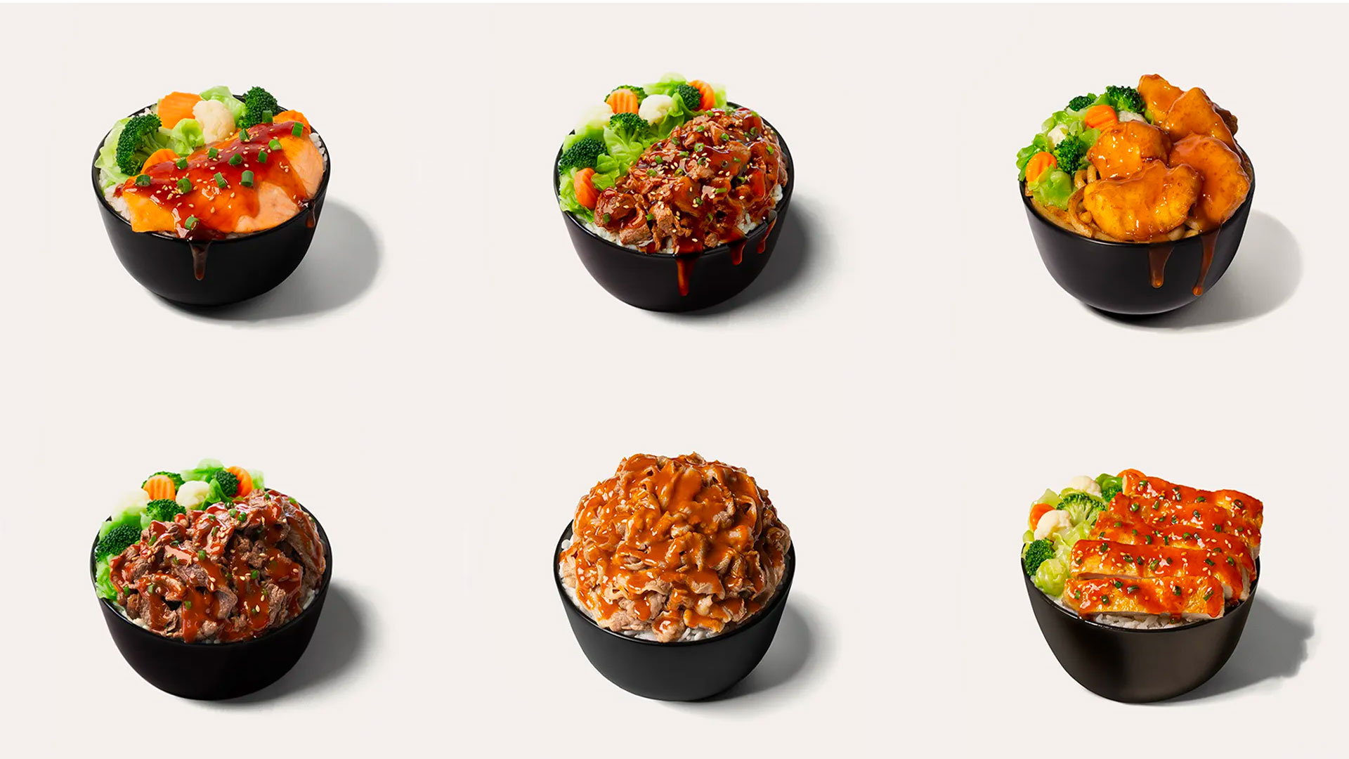
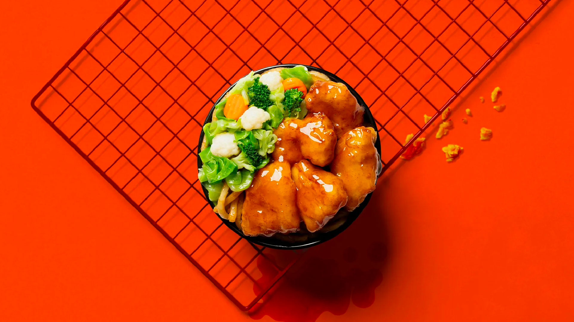
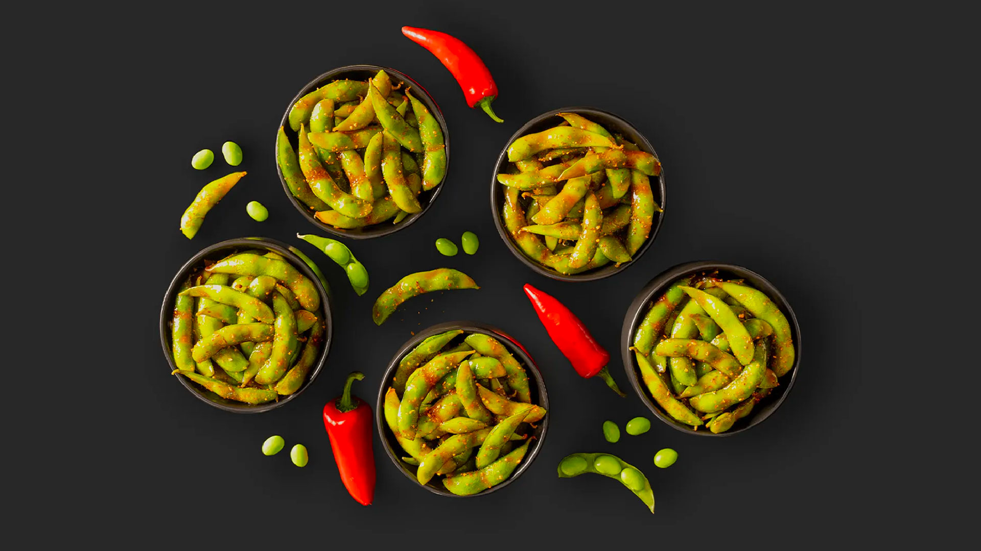
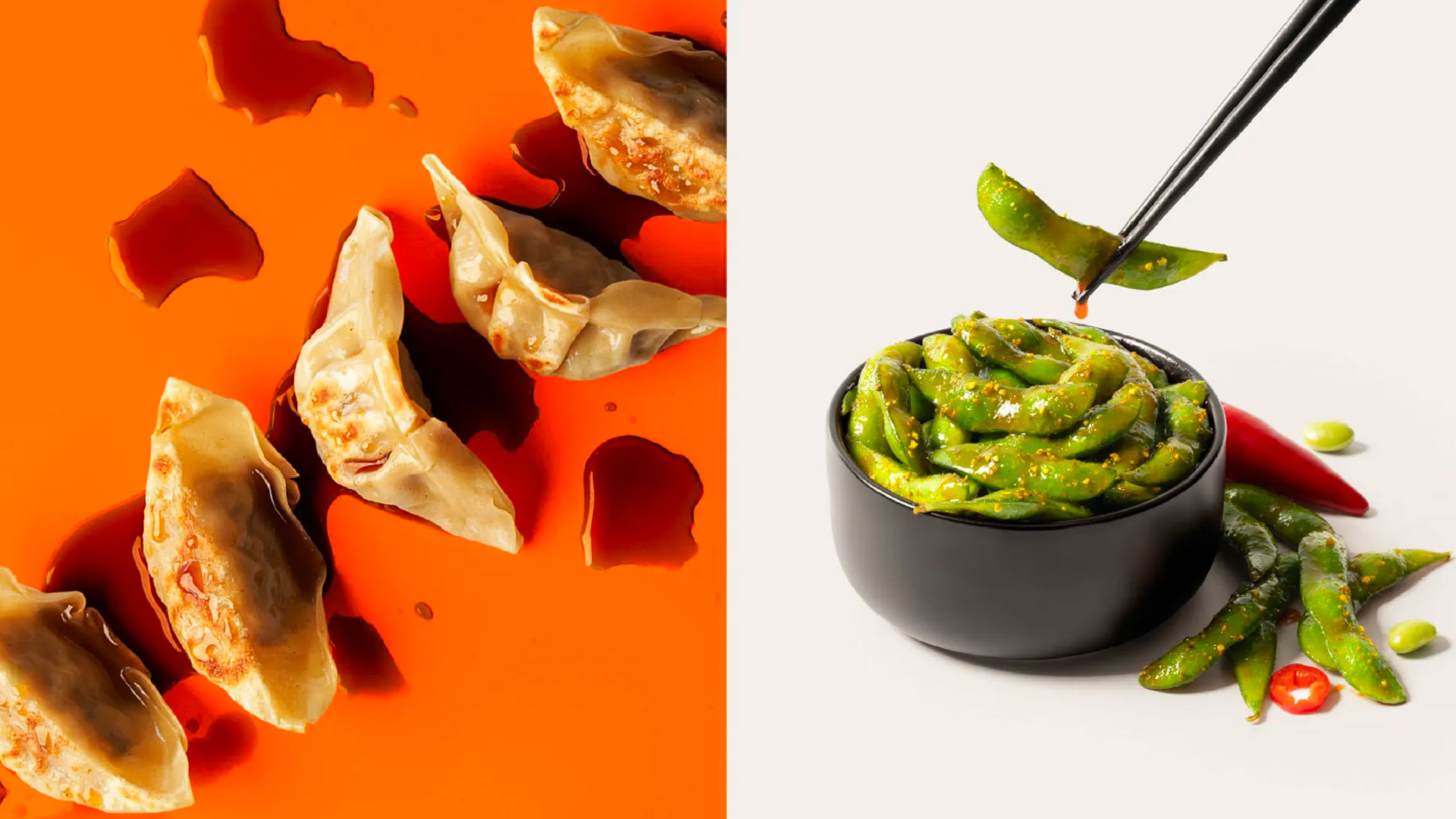
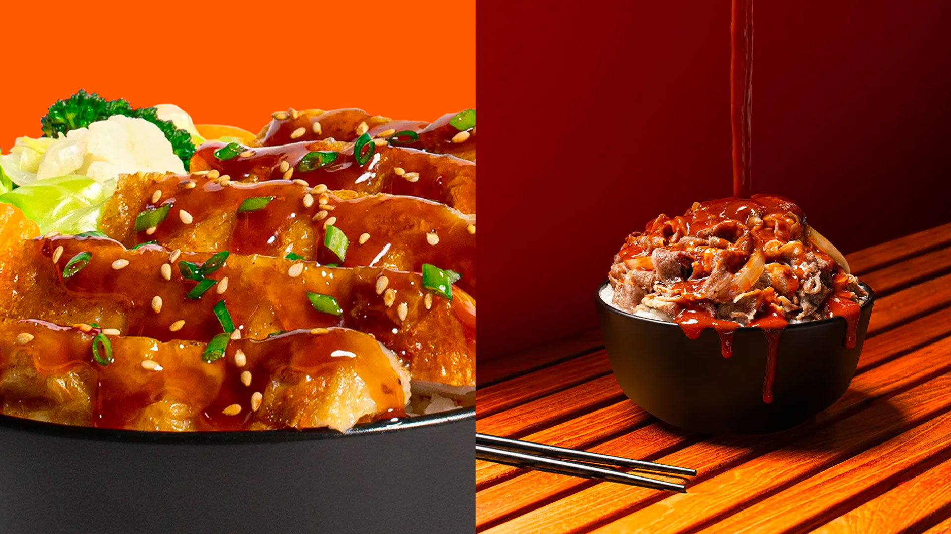
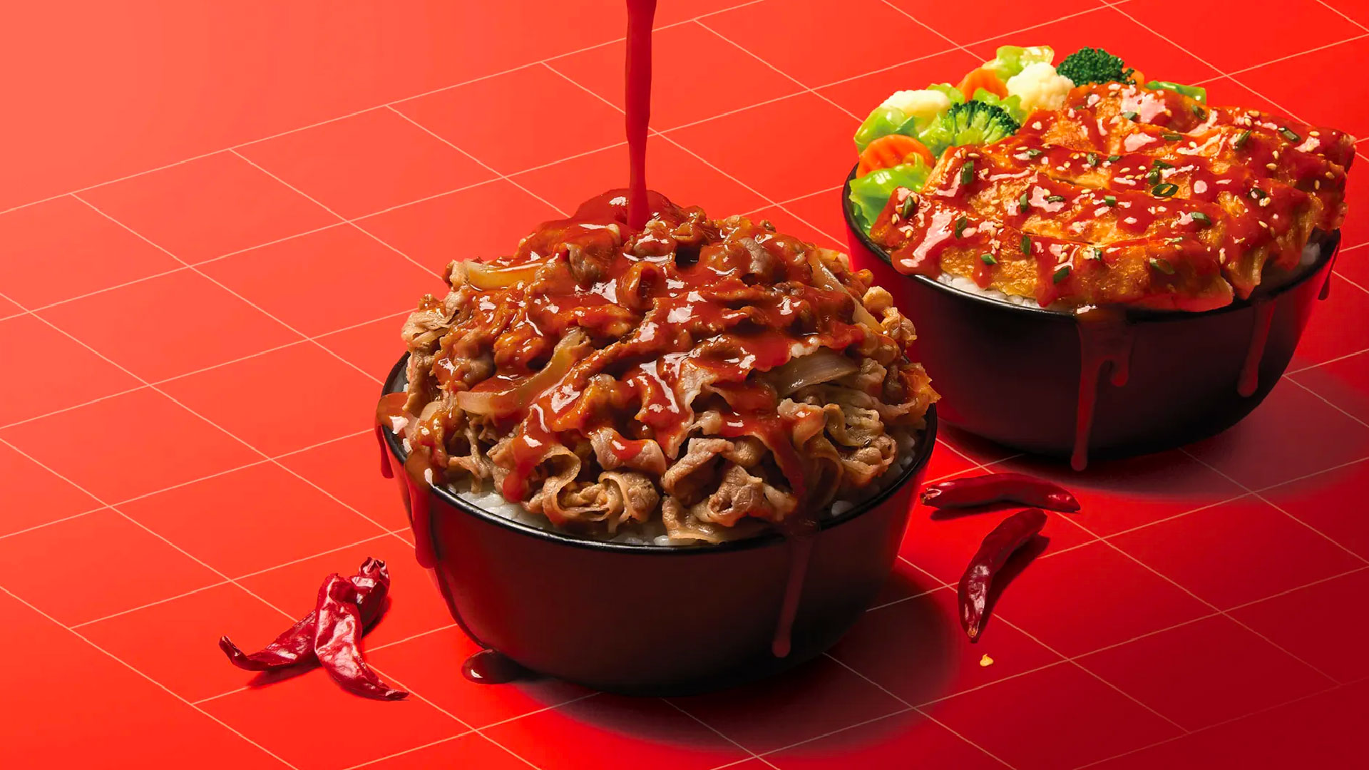
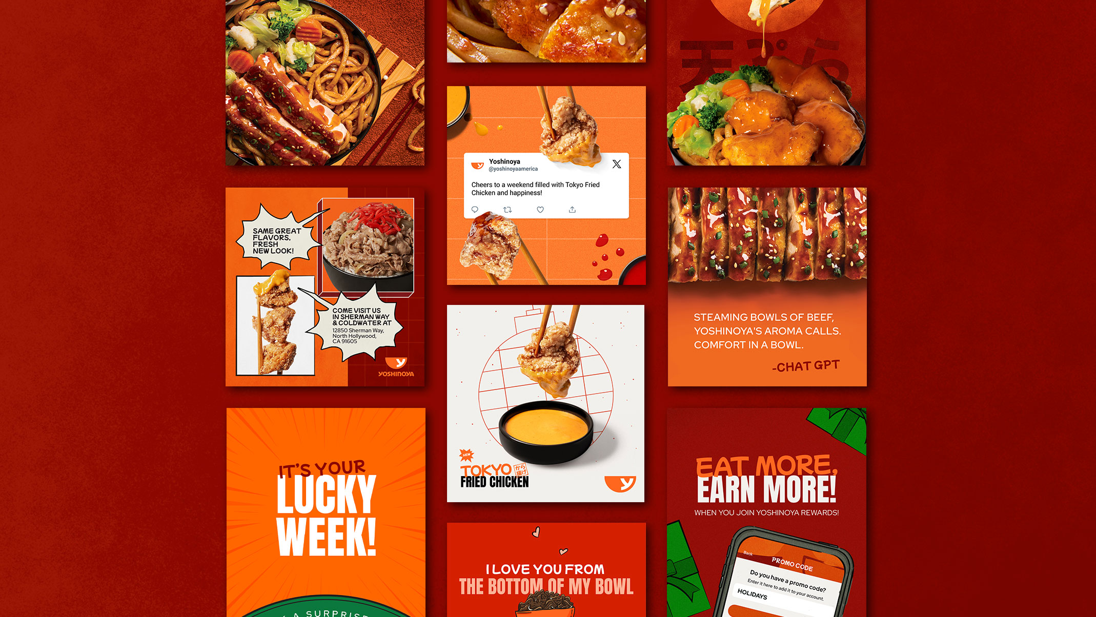
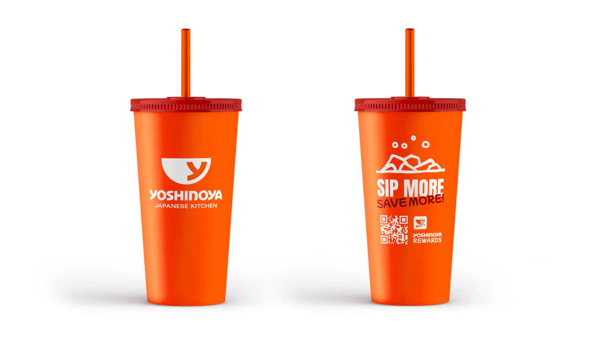
We opted for a palette of fresh colors inspired by the ingredients used to create Yoshinoya’s mouthwatering dishes. Shades of green, reminiscent of matcha tea and scallions, were paired with red and black to create a harmonious balance. We crafted a communication style that fuses tradition and modernity, blending Japanese type and geometric shapes with natural textures and materials. This translated into a consistent and appealing visual communication used across various applications, from cups and bags to menus and advertising.
What We’ve Made
-
Branding
-
Photography
-
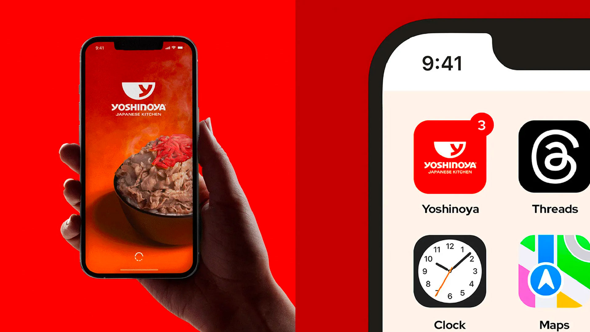
Social Media
-
Packaging
-
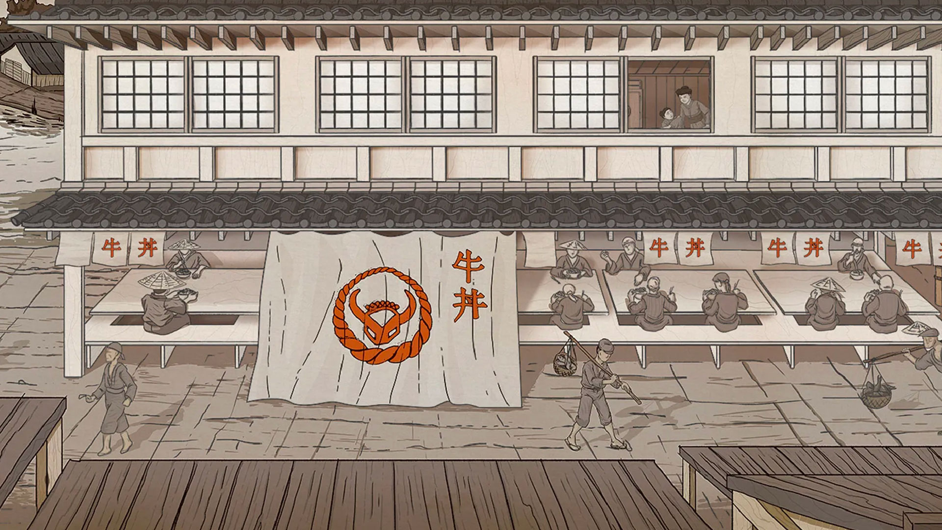
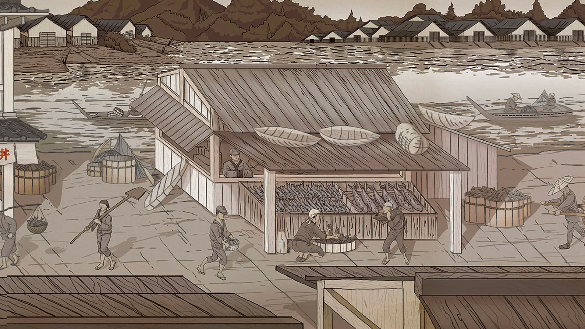
Illustration
-
Print

Branding
Photography

Social Media
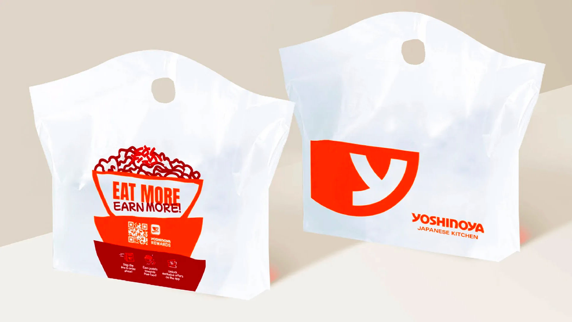
Packaging
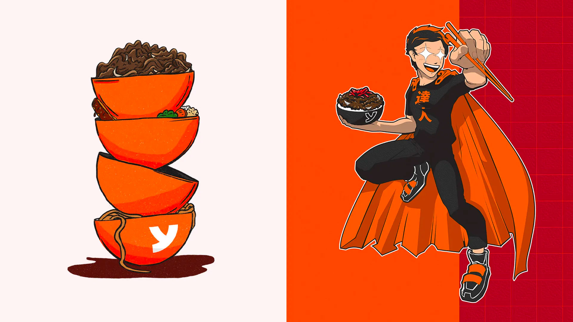
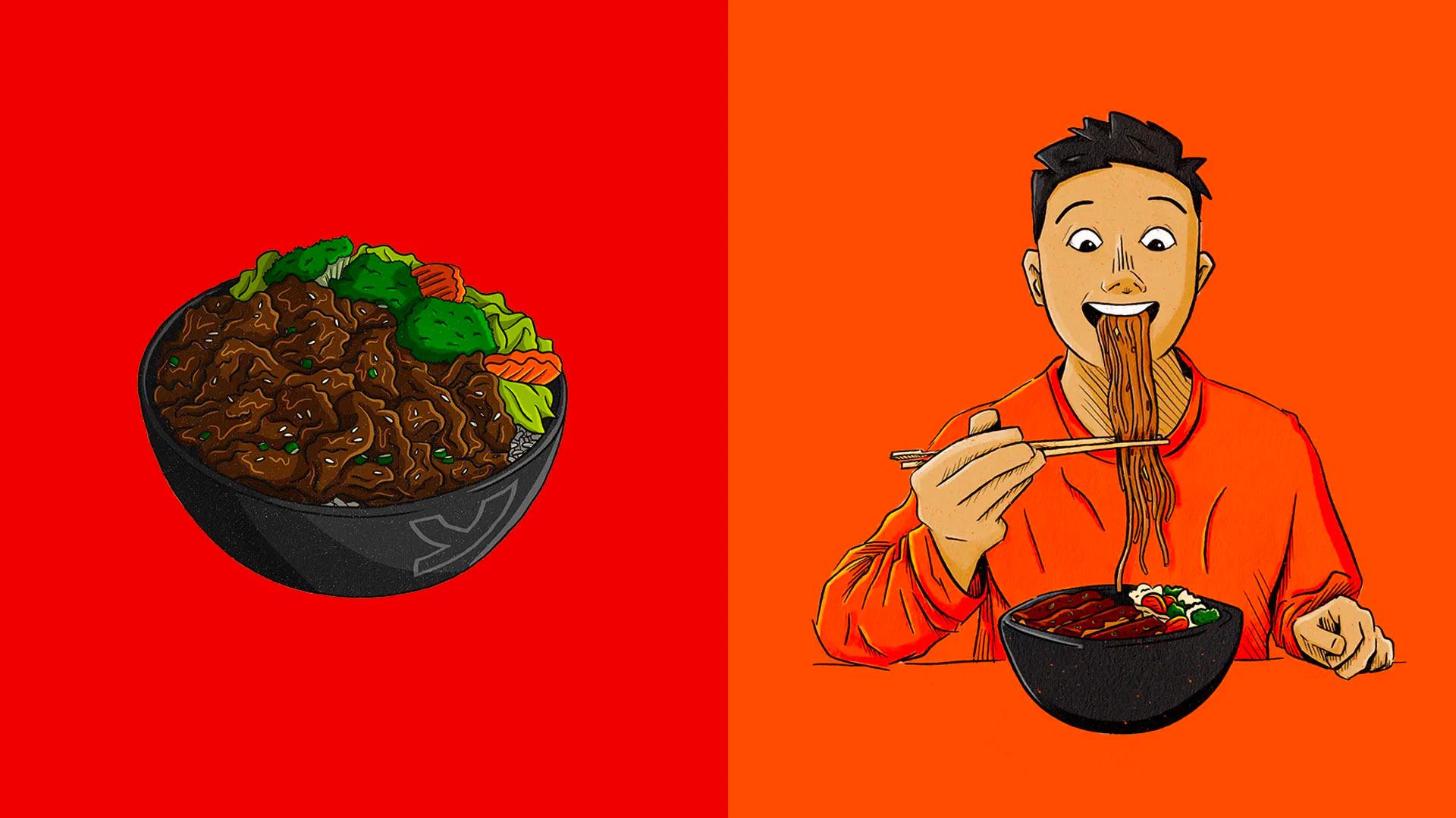
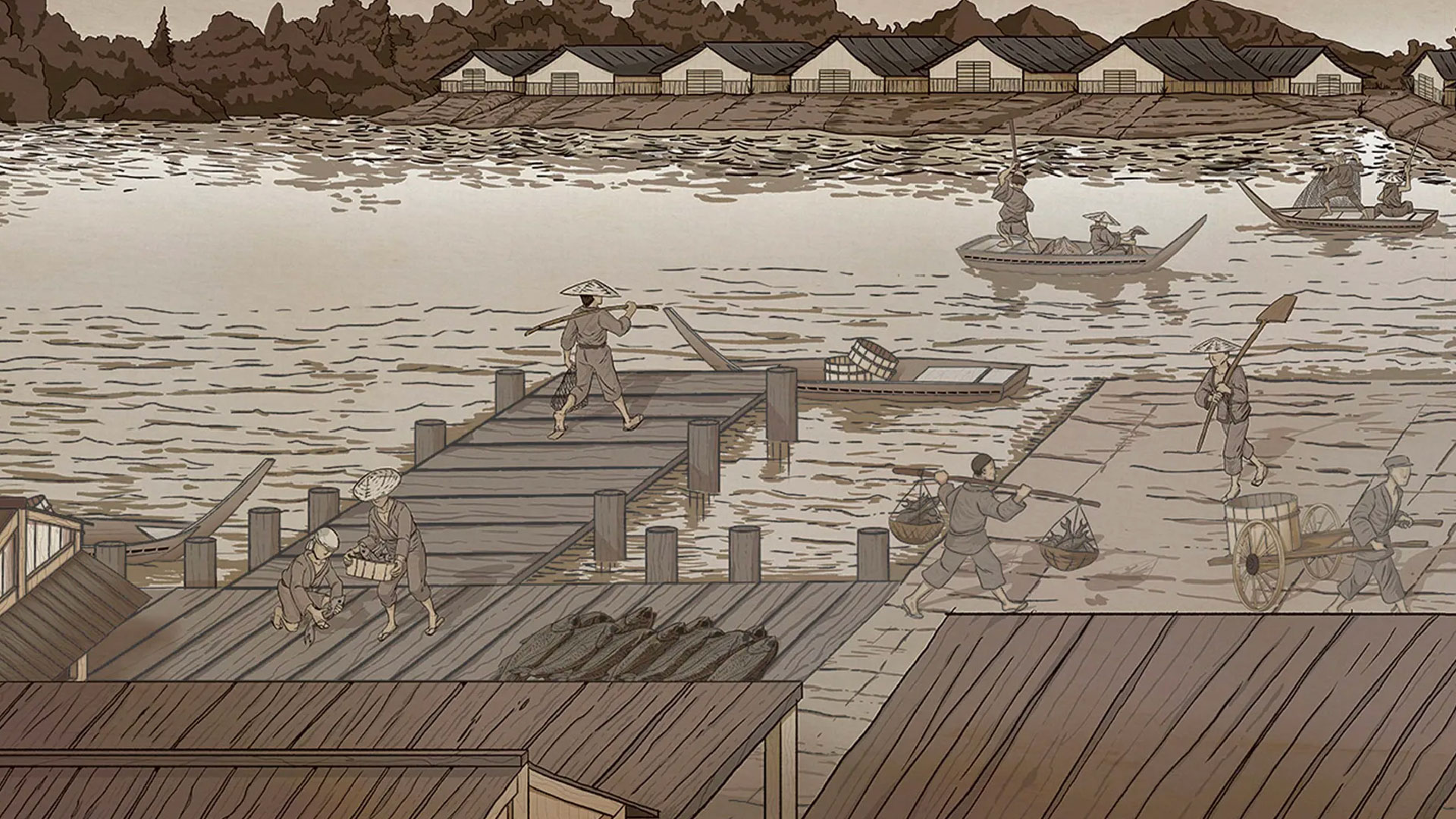
Illustration